As with most things in the world of technology, web design trends are always changing. How you set up your website a couple years ago, or even last year, may be outdated with what consumers are looking for today.
Audiences not only want to be informed about your brand or business, they want to feel as though they can relate to you and know you keep up with the times. That’s why it’s so important to show your brand personality throughout your website and let your visitors know you keep updated on trends.
But how do you know where to start? What web design trends do you need to bring your business and your website into 2018? Read on to discover the trends you need to give your audience exactly what they’re looking for.
1. Eye-Catching Colour Schemes
Many businesses are hoping to catch the eye of visitors with bold, vibrant colour schemes for their website. Experimenting with bright colours, or even contrasting colours, is no longer frowned upon in 2018.
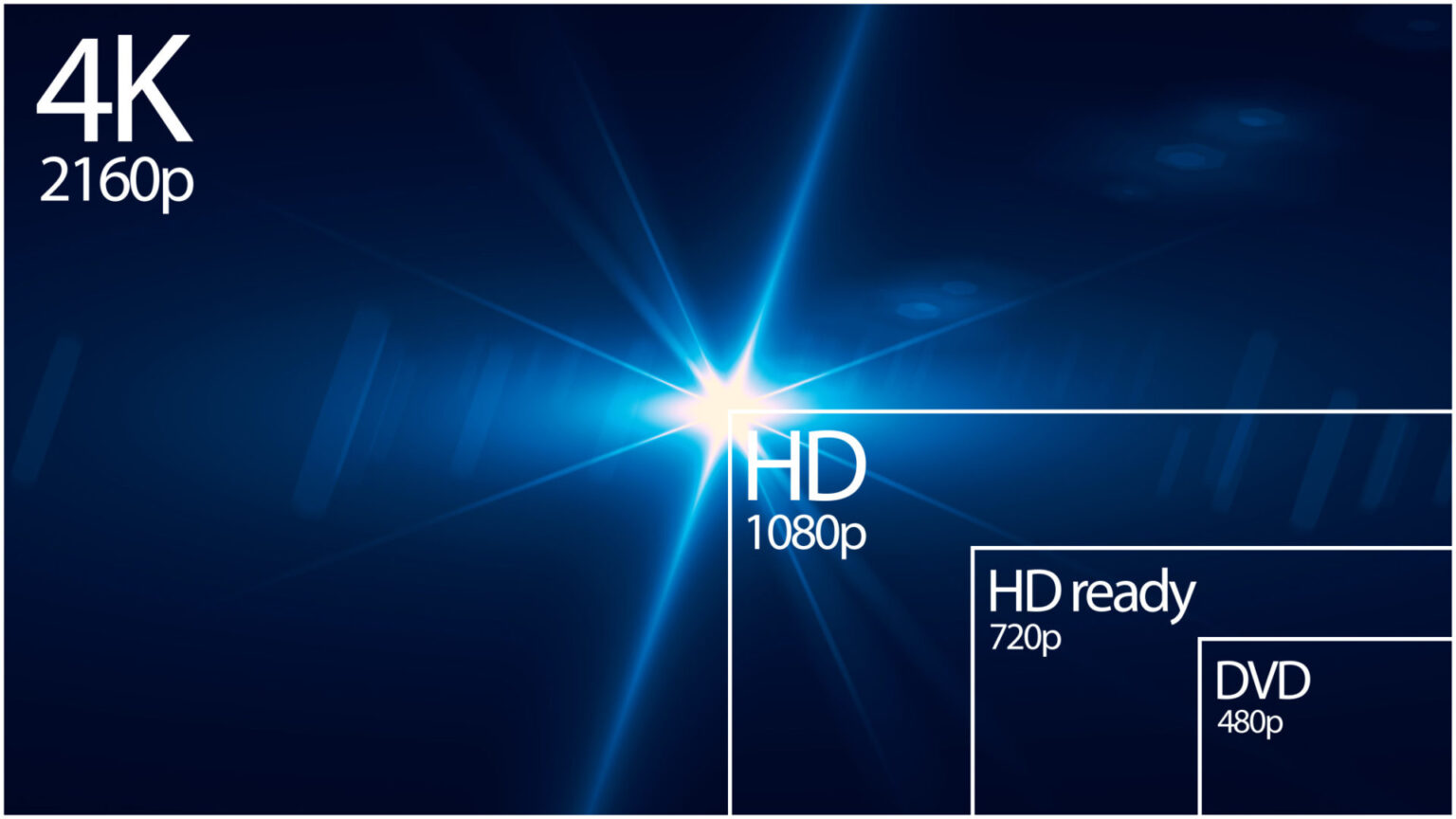
And the advances of computer monitor technology is making it easier for colour experimentation. No longer stuck with the same set hues, monitors can now display a larger array of rich colours.
It’s also the perfect design trend for any business who wants to set themselves apart from the traditional and be viewed as more contemporary or cutting-edge.
2. Bold Typography
Another way to set your website apart from the rest is with bold typography. Used within the Header text, bold typography can show the brand personality, set the mood for the site, and even evoke an emotion to the visitor.
While it’s important to keep the rest of the text easy for the visitor to read, the Header can break all the typography rules. It can now be eye-catching and thought-provoking with contrasting fonts, large letters, and uneven spacing.
3. Custom Illustrations
Gone are the days where the stock photos rule supreme. People have grown bored of the predictable images, which are increasingly becoming easy to spot and far too common.
For web designers who want to be more creative, they are turning to custom illustrations. These art pieces can be hand-drawn or created by a computer. They can be tailored to be more personal to the brand, set a fun tone for the site, and set them apart from competitors.
4. Integrated Animation
To break up the usual static design, one of the new web design trends is to create an integrated animation that engages the visitor and can help them focus on different aspects of the website itself.
This can take the form of animated thumbnail images, entertain the visitor as the site loads, guide them through the page scrolling process, or even help focus their attention on information the business really wants to emphasise to their audience.
5. Geometric Shapes
Why be flat when you can add visual interest and movement with shapes? That’s the reason geometric shapes has been one of the popular web design trends in 2018. It’s also another way to show brand personality.
Getting rid of the harsh grid layouts and sharp lines will give your website a more updated, visually friendly appeal to your audience.
6. Mobile-Friendly, Responsive Design
With the popularity of smartphone and tablet usage comes the rise in users surfing the web with their mobile devices. Not having a website designed to accommodate mobile visitors could spell disaster for businesses.
And it’s no longer enough to have a mobile-friendly website, it also needs to be responsive as well. That means not only will it look good on mobile devices, it will be easy for visitors to use and the site will perform as well as it would on a regular computer, no matter what size screen they may be using.
7. Asymmetric Layouts
Another way to set yourself apart, and to give a more contemporary aesthetic, is by breaking up the usual layout with asymmetric design.
Asymmetrical layouts provide a different user experience that takes the audience away from the norm, giving them a unique perspective of your brand.
It’s important to keep in mind, however, that your website content still needs to be easy to navigate, find, and read, but an asymmetric design can give it the visual appeal you’ve been looking for.
8. Gradient Colours
To go along with the use of vibrant colour schemes is the use of gradient colours. A gradient wash of colours can take a boring, flat colour background into a visually interesting page.
And it doesn’t have to just be featured solely on backgrounds. The use of gradient washes on logos or over otherwise boring photos can give new life to the usual images.
9. Handwriting Fonts
You don’t have to bring charm and interest to a page by only using photos or illustrations. The popularity of hand-drawn fonts is stronger than ever in 2018.
These typefaces aren’t limited to fancy calligraphy or professional block lettering, but branch out in the informal letters that actually look hand-drawn. These can give your brand a unique look and inject more personality that will appeal to your visitors.
10. Cinematography Backgrounds
Another way to step back from the stock photo trend is the use of cinematography as a background.
These are GIFS or high-quality videos that run on a continuous loop. They can be full-page or played behind a single section of the site. But instead of having a static picture, it creates movement and added interest for your page.
An even more advanced version of cinematography combines the use of a photo and video in one, creating movement in only one area of the picture.
These Web Design Trends Will Bring Your Website into 2018
Whether you are updating an existing website or building one from scratch, incorporating these web design trends will be sure to give your brand the updated, unique look that audiences will love.
Need help with the design of your website? Contact us today to set up a consultation!


